Hi everyone,
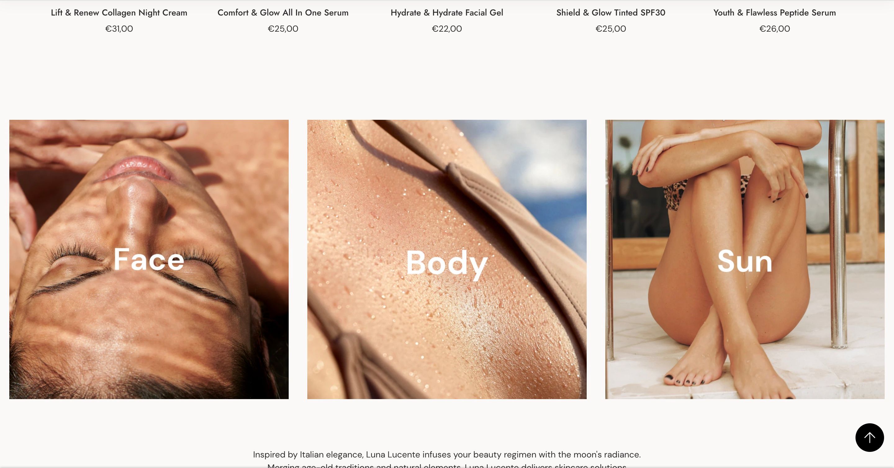
I want to showcase these 3 pictures smaller on both desktop as mobile. Which code do i need for this. I want to customize the sized myself to see what fits best. So if anyone can provide the code need it would be very appreciated!
URL is www.lunalucente.com
Hello @lunalucenteskin
Go to online store > Edit theme code > theme.liquid > Insert the code before closing “” .

- Then find the main.css file.
- Then add the following code at the end of the file and press ‘Save’ to save it.
.m-mixed-layout__inner {
justify-content: center !important;
}
@media (min-width: 1024px) {
    .lg\:m\:w-1\/3 {
        width: 26% !important;
    }
}
- Here is the result you will achieve:
-You can reduce “26%” to a smaller number if you want a smaller image and vice versa.
- Please press ‘Like’ and mark it as ‘Solution’ if you find it helpful. Thank you.