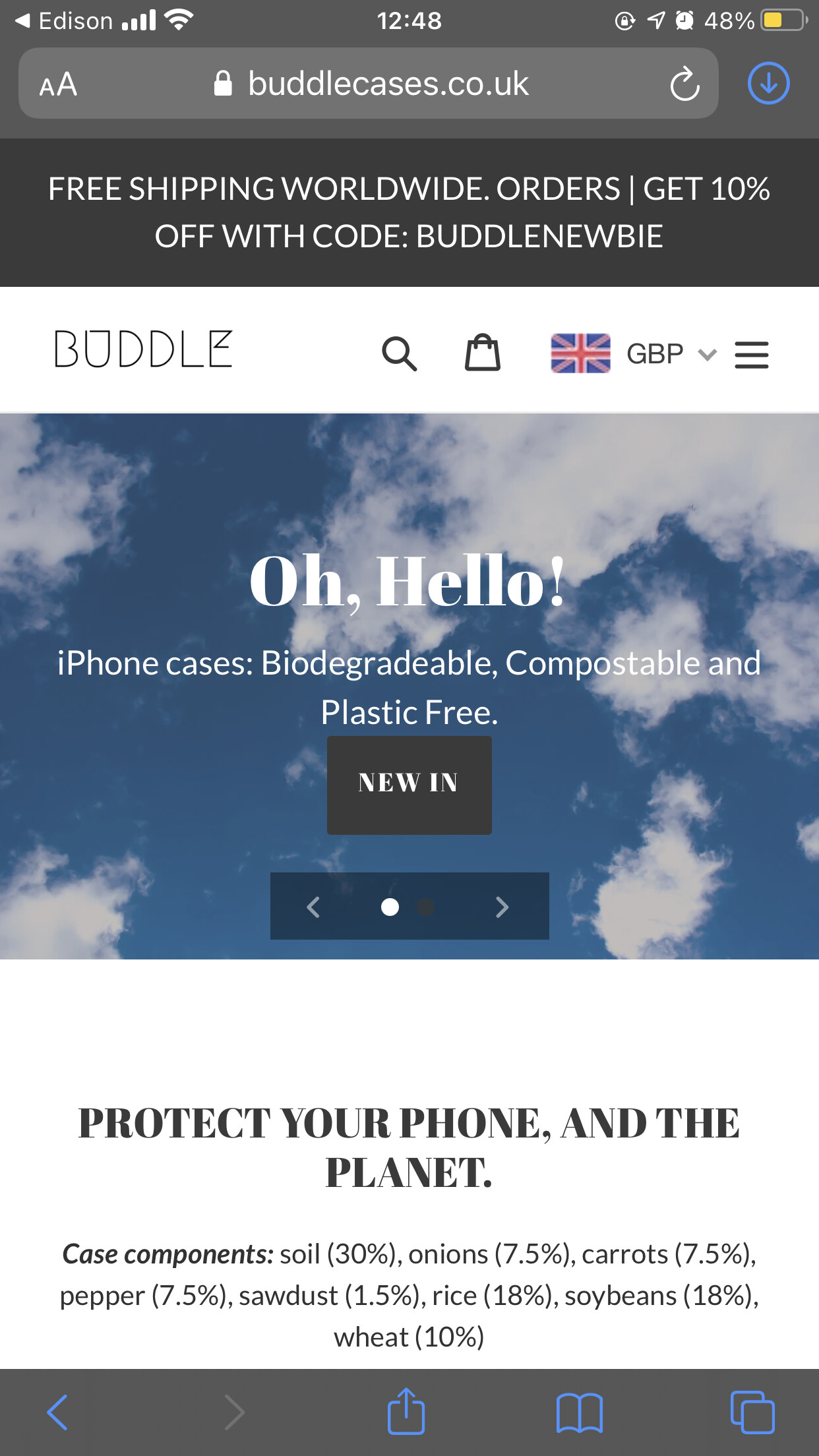
Debut theme - Slideshow text and button overlay on mobile

Hello Shopify community,

I would like to change the way a slideshow with text or text and a button looks on mobile devices.

Currently, the slideshow looks good on desktop but on mobile, the text and the button is under the slides.

I would like to have the slideshow pictures have a text overlay and button overlay on mobile and make it look the same as it does on the desktop version, perhaps by resizing the text size on the mobile version and putting the text and the button on top of the images. The URL of my store is: (stifc.com)

Any help or suggestions would be highly appreciated!

@STIFCforum

Thanks for post

i have check this issue but sorry i can’t see this slideshow section can you please show me.

I turned off the slideshow but I just turned it back on its at the top of the homepage so you could check.

Thanks!

@STIFCforum

Thanks or it

  1. Go to Online Store->Theme->Edit code
  2. Asset->/theme.css->paste below code at the bottom of the file.
@media only screen and (max-width: 749px) {
.slideshow__title, .slideshow__subtitle {
    display: inline-block !important;
}
.slideshow__text-content--mobile {display: none !important;}
}

@KetanKumar

Thanks for your reply!

I’ve pasted the code but the text doesn’t adjust on mobile and I can’t see the button on the second slide.

@STIFCforum

sorry for this

can you please add this code

@media only screen and (max-width: 749px) {
.slideshow__btn {
    display: inline-block !important;
}
}

@KetanKumar

Hello and thank you for your reply!

This code partially solves the issue and I was able to adjust the text and button size myself.

Just one more thing, how could I change the picture opacity on mobile because the picture is bright and it’s hard to see the text. This option works automatically on desktop, its called “show overlay” in the slideshow settings. Also is it possible to make the slideshow buttons on mobile look the same as on desktop?

@STIFCforum

Yes, please try this code

.slideshow__overlay::before {
    content: '';
    position: absolute;
    top: 0;
    right: 0;
    bottom: 0;
    left: 0;
    background-color: var(--color-image-overlay);
    opacity: var(--opacity-image-overlay);
    z-index: 2;
}

@KetanKumar

Thank you that code solved the issue!

Do you know if it’s possible to make the slideshow buttons on mobile look the way they look on desktop or something similar to that?

I appreciate all your help.

@STIFCforum

Thanks for your feedback and support.

@media only screen and (max-width: 749px) {
.slideshow__text-wrap--mobile {display: none;}
.slideshow__controls {
    top: auto;
    left: 0;
    bottom: 0;
}
.slideshow__arrows {display: flex;}
.slideshow__arrows .slideshow__arrow-previous {order: -1;}
.slideshow__arrows .slideshow__arrow-next {order: 1;}
}

@KetanKumar

Thanks so much that helped fix the arrows.

There seems to be just one minor issue now when I pasted the last code.

Whenever I tap the slideshow on mobile or interact with it there are blue lines around the picture. Do you know a way to fix this?

@STIFCforum

Thanks,

yes, please add this code.

:focus {outline: none !important;}

@KetanKumar Thank you for this! Also worked for myself. One thing, how can I make the height of the slideshow slightly bigger for mobile? At the moment it looks quite squashed.

@buddlecases

thanks for it i can’t see any issue. how can i guide you

Hello @KetanKumar on mobile the button is quite big so it all looks squashed. Is there a way to increase the height of the slideshow or decrease the button

@buddlecases

yes, reduce font size may set proper

Hi @KetanKumar

my website is sneakersafe.co.uk

How can I make this black button smaller on mobile version? Thank you

@Timito

Thanks for it

@media only screen and (max-width: 749px) {
.slideshow__btn {
    font-size: 12px;
    line-height: normal;
    padding: 11px;
    min-height: 1.125rem;
}
}

@KetanKumar Perfect thank you

@Timito

it’s my pleasure to help us