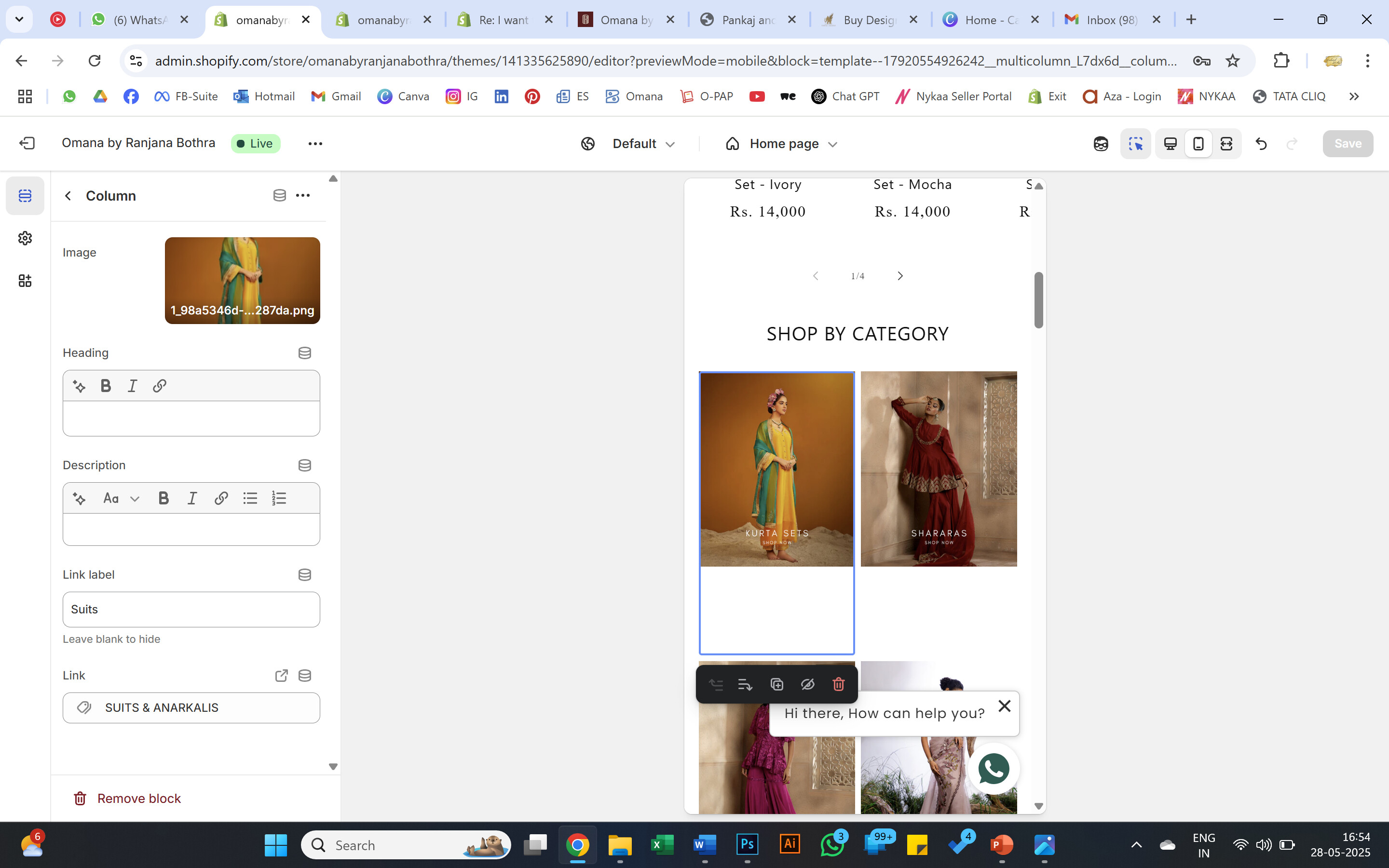
I am using the below code which works but there a few glitches with the latest updates in the theme :
I am unable to customize the no., of columns i want to show in each row on desktop & mobile. Its auto set to 1 column on mobile & i made some changes so i managed to get 3 columns on desktop.
Can anyone suggest changes to code that can help me get 2 columns on mobile view too ?
{{ 'section-multicolumn.css' | asset_url | stylesheet_tag }}

##
{{ section.settings.title | escape }}

{%- if section.settings.button_label != blank and section.settings.swipe_on_mobile -%}
{{ section.settings.button_label | escape }}
{%- endif -%}

{%- if section.settings.button_label != blank -%}

{{ section.settings.button_label | escape }}

{%- endif-%}

{% schema %}
{
"name": "t:sections.multicolumn.name",
"class": "spaced-section spaced-section--full-width",
"tag": "section",
"settings": [
{
"type": "text",
"id": "title",
"default": "Multicolumn",
"label": "t:sections.multicolumn.settings.title.label"
},
{
"type": "select",
"id": "image_width",
"options": [
{
"value": "third",
"label": "t:sections.multicolumn.settings.image_width.options__1.label"
},
{
"value": "half",
"label": "t:sections.multicolumn.settings.image_width.options__2.label"
},
{
"value": "full",
"label": "t:sections.multicolumn.settings.image_width.options__3.label"
}
],
"default": "full",
"label": "t:sections.multicolumn.settings.image_width.label"
},
{
"type": "select",
"id": "image_ratio",
"options": [
{
"value": "adapt",
"label": "t:sections.multicolumn.settings.image_ratio.options__1.label"
},
{
"value": "portrait",
"label": "t:sections.multicolumn.settings.image_ratio.options__2.label"
},
{
"value": "square",
"label": "t:sections.multicolumn.settings.image_ratio.options__3.label"
},
{
"value": "circle",
"label": "t:sections.multicolumn.settings.image_ratio.options__4.label"
}
],
"default": "adapt",
"label": "t:sections.multicolumn.settings.image_ratio.label"
},
{
"type": "select",
"id": "column_alignment",
"options": [
{
"value": "left",
"label": "t:sections.multicolumn.settings.column_alignment.options__1.label"
},
{
"value": "center",
"label": "t:sections.multicolumn.settings.column_alignment.options__2.label"
}
],
"default": "left",
"label": "t:sections.multicolumn.settings.column_alignment.label"
},
{
"type": "select",
"id": "background_style",
"options": [
{
"value": "none",
"label": "t:sections.multicolumn.settings.background_style.options__1.label"
},
{
"value": "primary",
"label": "t:sections.multicolumn.settings.background_style.options__2.label"
},
{
"value": "secondary",
"label": "t:sections.multicolumn.settings.background_style.options__3.label"
}
],
"default": "primary",
"label": "t:sections.multicolumn.settings.background_style.label"
},
{
"type": "text",
"id": "button_label",
"default": "Button label",
"label": "t:sections.multicolumn.settings.button_label.label"
},
{
"type": "url",
"id": "button_link",
"label": "t:sections.multicolumn.settings.button_link.label"
},
{
"type": "checkbox",
"id": "swipe_on_mobile",
"default": false,
"label": "t:sections.multicolumn.settings.swipe_on_mobile.label"
}
],
"blocks": [
{
"type": "column",
"name": "t:sections.multicolumn.blocks.column.name",
"settings": [
{
"type": "image_picker",
"id": "image",
"label": "t:sections.multicolumn.blocks.column.settings.image.label"
},
{
"type": "url",
"id": "image_link",
"label": "Store link"
},
{
"type": "text",
"id": "title",
"default": "Column",
"label": "t:sections.multicolumn.blocks.column.settings.title.label"
},
{
"type": "richtext",
"id": "text",
"default": "

Pair text with an image to focus on your chosen product, collection, or blog post. Add details on availability, style, or even provide a review.

",
"label": "t:sections.multicolumn.blocks.column.settings.text.label"
}
]
}
],
"presets": [
{
"name": "t:sections.multicolumn.presets.name",
"blocks": [
{
"type": "column"
},
{
"type": "column"
},
{
"type": "column"
}
]
}
]
}
{% endschema %}